It Azbee A Very Good Year

And now, a little ego-dance from the graphic design dept.
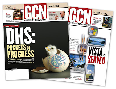
Above: two of my babies that were recognized this year at the national ASBPE (or "azbee") awards in NYC. A bittersweet honor, since the publisher was sold after these issues were done, and I didn't make the final cut with the new company. Thus, I heard about the winners from some loyal ex-coworkers. Publishing is a brutal gig sometimes. Maybe I shoulda joined the Marines.
But the DHS cover was a blast to do. I wanted to symbolize the newly restructured Homeland Security Department as a hatchling eagle, complete with DHS logo tattooed on the eggshell. Lots of negative space, big type, full-bleed. Simple.
As it turns out, baby vultures look more identifiable as "bald eagles" than proper bald eagles. So, my metaphor for the new Homeland Security Department ended up being buzzard.
...Read into that what you will.
Somehow it worked on the cover, and it won a National Gold (front cover design/news tabloid/80,000+ circ).
The Windows Vista cover was not one of my favorites. Seemed like all the tech magazines were doing cover-stories on Vista, and they all looked the same. Desperate for a new angle, I decided the windows logo looked like a piece of stale sushi, and took off from there. That would've been fine, but the cover ended up being over-thought and bloated with too many puns.
Anyway. It won the National Bronze (front cover/computer generated). I have no idea why...maybe that category was thin on entries or something. Many business-news tabloids end up cramming five story-starts on the cover, so GCN stood out by giving good space for a lead story with art.
Eh, enough about that. I was happy with the vulture/Homeland Security cover, though. The little hatchling guy does resemble DHS Secretary Michael Chertoff a bit, dontcha think?


2 comments:
Ah, you don't need me to tell you again what I've been sayin' for some time: You da man!
Actually, you have amazingly strong conceptual skills and they come to the forefront in your publishing work. Page layouts, covers, typography -- all just top-notch.
Now if we can just steer you away from your Photoshop mirror-image play, then we'd REALLY be on to something! (Of course, I jest...)
Nuf!
Harshness!
And to think I was the one who razzed the design of the first Goldfrapp lp for that same thing. Hypocrite, me.
Post a Comment